こんにちは、TechFULでアルバイトをしているAtriaです。 現在はTechFULで出題される問題の作成をしています。
さて、私は趣味でAndroidアプリの開発をしているのですが、その中でどうしてもXML上で 画像つきのボタン が作りたくなりました。
今回はXML上で画像つきのボタンを作る際の知見を共有しようと思います。
環境
- AndroidStudio 4.3.0 (Arctic Fox 2020.3.1)
- MinSDK API26 (Android 8.0 Oreo)
今回の目的
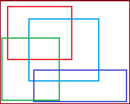
今回はWindowsのペイントソフトで作成した以下の画像をボタンの右側に配置することを目的とします。
記事中で画像のファイル名は button_image.png で管理しています。
1. android:drawable~~ の愚直な利用
僕が知る限り一番お手軽な実装方法です。
<Button/> に対して属性 android:drawableLeft/Top/Right/Bottom をつけることで画像を指定します。
間隔の設定には android:drawablePadding を利用します。
しかし愚直にこの方法を利用すると画像サイズの自動スケーリングができません。
ただし、drawableファイルのラッパーを作成することによって手動で画像サイズを縮小or拡大して表示する事ができます。
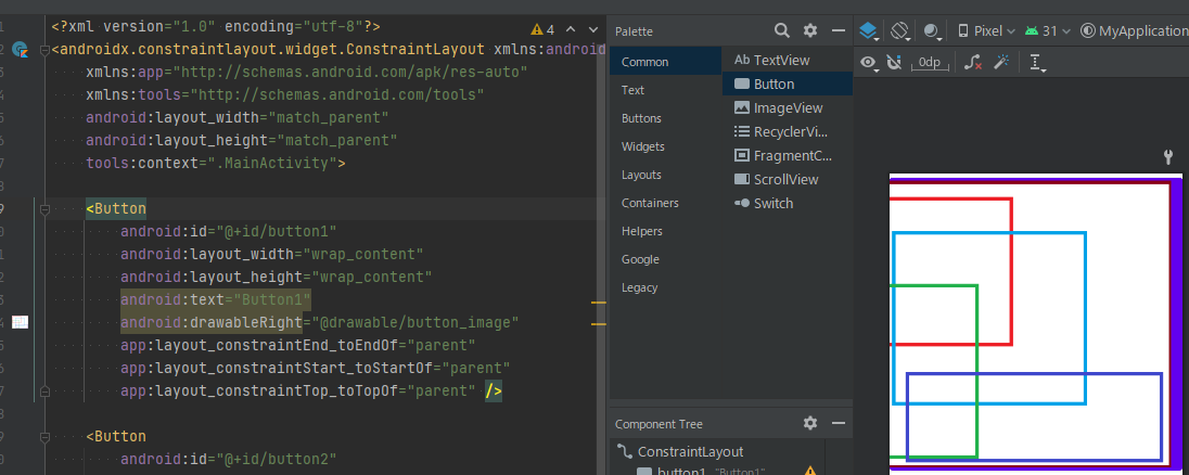
また、ここまでのactivity_main.xmlのコードは以下のとおりです。
<?xml version="1.0" encoding="utf-8"?>
<androidx.constraintlayout.widget.ConstraintLayout xmlns:android="http://schemas.android.com/apk/res/android"
    xmlns:app="http://schemas.android.com/apk/res-auto"
    xmlns:tools="http://schemas.android.com/tools"
    android:layout_width="match_parent"
    android:layout_height="match_parent"
    tools:context=".MainActivity">

    <Button
        android:id="@+id/button1"
        android:layout_width="wrap_content"
        android:layout_height="wrap_content"
        android:text="Button1"
        android:drawableRight="@drawable/button_image"
        app:layout_constraintEnd_toEndOf="parent"
        app:layout_constraintStart_toStartOf="parent"
        app:layout_constraintTop_toTopOf="parent" />
</androidx.constraintlayout.widget.ConstraintLayout>
2. 1の手順に加えてdrawableファイルのラッパーを利用する
この手順では1の手順に加えて新しく button_image_wrapper というdrawableファイルを定義し、button_image の手動スケーリングを行います。
ただし、この方法はMinSDKが23以上である必要があります。
button_image_wrapper.xml ではbutton_imageを上下24dpに調整するようにlayer-listを用いて記述します。
<?xml version="1.0" encoding="utf-8"?>
<layer-list xmlns:android="http://schemas.android.com/apk/res/android" >
    <item
        android:drawable="@drawable/button_image"
        android:width="24dp"
        android:height="24dp"
        />
</layer-list >
ラッパーファイルを作成した後はシンプルで、android:drawableRight の部分に作成したラッパーファイル button_image_wrapper.xml を指定してあげるだけです。

また、ここまでのactivity_main.xmlのコードは以下のとおりです。
<?xml version="1.0" encoding="utf-8"?>
<androidx.constraintlayout.widget.ConstraintLayout xmlns:android="http://schemas.android.com/apk/res/android"
    xmlns:app="http://schemas.android.com/apk/res-auto"
    xmlns:tools="http://schemas.android.com/tools"
    android:layout_width="match_parent"
    android:layout_height="match_parent"
    tools:context=".MainActivity">

    <Button
        android:id="@+id/button1"
        android:layout_width="wrap_content"
        android:layout_height="wrap_content"
        android:text="Button1"
        android:drawableRight="@drawable/button_image"
        app:layout_constraintEnd_toEndOf="parent"
        app:layout_constraintStart_toStartOf="parent"
        app:layout_constraintTop_toTopOf="parent" />

    <Button
        android:id="@+id/button2"
        android:layout_width="wrap_content"
        android:layout_height="wrap_content"
        android:drawableRight="@drawable/button_image_wrapper"
        android:text="Button2"
        app:layout_constraintEnd_toEndOf="parent"
        app:layout_constraintStart_toStartOf="parent"
        app:layout_constraintTop_toBottomOf="@+id/button1" />
</androidx.constraintlayout.widget.ConstraintLayout>
また、利用する場面があるかはわかりませんが、ラッパーdrawableファイルを作成しない方法もご紹介いたします。
3. LinerLayoutを利用した疑似ボタンの作成
この手順では <Button/> タグを利用せず、代わりにLinerLayout を利用して擬似的にボタンを作成します。
この手順は1,2の手法と比べてより細かいカスタマイズを行うことができるという利点があります。
まず、見た目がボタンらしくなるようにdrawable要素を作成します。
<?xml version="1.0" encoding="utf-8"?>
<shape xmlns:android="http://schemas.android.com/apk/res/android">
    <solid android:color="#abcdef"/>
    <corners android:radius="5dp"/>
</shape>
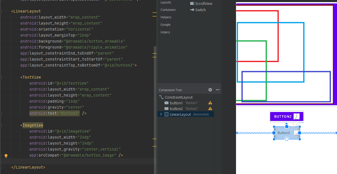
次にLinearLayout を定義し、中にはTextViewとImageViewを入れ込みます。
各要素のパラメータ(paddingやgravity)を変更することで、1,2の手法と比べてより細かいカスタマイズを行うことができます。
    <LinearLayout
        android:layout_width="wrap_content"
        android:layout_height="wrap_content"
        android:orientation="horizontal"
        android:layout_marginTop="16dp"
        android:background="@drawable/button_drawable"
        app:layout_constraintEnd_toEndOf="parent"
        app:layout_constraintStart_toStartOf="parent"
        app:layout_constraintTop_toBottomOf="@+id/button2">

        <TextView
            android:id="@+id/textView"
            android:layout_width="wrap_content"
            android:layout_height="wrap_content"
            android:padding="16dp"
            android:gravity="center"
            android:text="Button3" />

        <ImageView
            android:id="@+id/imageView"
            android:layout_width="24dp"
            android:layout_height="24dp"
            android:layout_gravity="center_vertical"
            app:srcCompat="@drawable/button_image" />

    </LinearLayout>
しかし、この状態ではタップしたときのリップルアニメーションが消えてしまうので、最後にリップルアニメーションをかける設定を行います。
リップルアニメーションを定義するファイル ripple_animation.xml を新しく作成し、ボタンに対して android:foreground="@drawable/ripple_animation" を追加して適用してあげます。
<?xml version="1.0" encoding="utf-8"?>
<ripple xmlns:android="http://schemas.android.com/apk/res/android"
    android:color="#abcdef">
    <item
        android:id="@android:id/mask"
        android:drawable="@drawable/button_drawable"/>
</ripple>
これにて、タップした際のアニメーションも行われるようになりました。
また、ここまでのactivity_main.xmlのコードは以下のとおりです。
<?xml version="1.0" encoding="utf-8"?>
<androidx.constraintlayout.widget.ConstraintLayout xmlns:android="http://schemas.android.com/apk/res/android"
    xmlns:app="http://schemas.android.com/apk/res-auto"
    xmlns:tools="http://schemas.android.com/tools"
    android:layout_width="match_parent"
    android:layout_height="match_parent"
    tools:context=".MainActivity">

    <Button
        android:id="@+id/button1"
        android:layout_width="wrap_content"
        android:layout_height="wrap_content"
        android:text="Button1"
        android:drawableRight="@drawable/button_image"
        app:layout_constraintEnd_toEndOf="parent"
        app:layout_constraintStart_toStartOf="parent"
        app:layout_constraintTop_toTopOf="parent" />

    <Button
        android:id="@+id/button2"
        android:layout_width="wrap_content"
        android:layout_height="wrap_content"
        android:layout_marginTop="16dp"
        android:drawableRight="@drawable/button_image_wrapper"
        android:text="Button2"
        app:layout_constraintEnd_toEndOf="parent"
        app:layout_constraintStart_toStartOf="parent"
        app:layout_constraintTop_toBottomOf="@+id/button1" />

    <LinearLayout
        android:layout_width="wrap_content"
        android:layout_height="wrap_content"
        android:orientation="horizontal"
        android:layout_marginTop="16dp"
        android:background="@drawable/button_drawable"
        android:foreground="@drawable/ripple_animation"
        app:layout_constraintEnd_toEndOf="parent"
        app:layout_constraintStart_toStartOf="parent"
        app:layout_constraintTop_toBottomOf="@+id/button2">

        <TextView
            android:id="@+id/textView"
            android:layout_width="wrap_content"
            android:layout_height="wrap_content"
            android:padding="16dp"
            android:gravity="center"
            android:text="Button3" />

        <ImageView
            android:id="@+id/imageView"
            android:layout_width="24dp"
            android:layout_height="24dp"
            android:layout_gravity="center_vertical"
            app:srcCompat="@drawable/button_image" />

    </LinearLayout>

</androidx.constraintlayout.widget.ConstraintLayout>
この疑似ボタンはあくまでも "疑似" ですので、プログラムの方でクリックリスナーなどを定義して運用してあげてください。
まとめ
今回はAndroidで画像つきのボタンを作成する3つの方法をご紹介いたしました。
3つめの方法はかなり複雑で利用する場面があるかどうかわかりませんが、どの手法が自分のプロジェクトに合っているかを各自判断して利用していただけると幸いです。
本日の記事は以上になります。